When we were creating our trailer, we discussed how we were going to set out our work and we came to the conclusion that it needed to be consistent throughout, where all of the titles and shots were at the same quality. One way to make your product stand out from the rest is to have something unique about it, this could be from what idea the product is or how it is planned; this will allow people to remember the film and the products allowing you to stand out above other competitors and products. If the film or product is directed properly then people will recognise it, this can also be seen as free advertisement as people will talk about the product spreading it across the public.
Iconic image
|
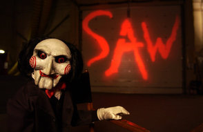
Saw (Franchise)
In 2004 Saw was first created, Saw had a huge impact in the horror film scene as its violent ad gory scenes influenced many films today, the torture aspect of the film really got to some people and this is how it made such a huge mark in the horror film scene. |
|
iconic text
|
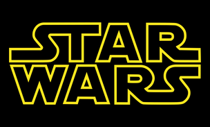
Star Wars (Franchise)
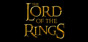
In 1977 the first "star wars" movie was introduced, ever since then Star Wars was said to be one of the biggest movie franchises in the industry, to this day are still producing films. The reason why the text is so iconic is because of its bold and vibrant colour that surrounds the words "Star Wars". The Lord Of The Rings
In 2001 the first "Lord Of The Rings" film was showed at the cinema, this film made a mark in the fantasy scence and is seen to be one of the biggest mythical franchises of its time, the text that they se to advertise the film is very detailed and the font makes it iconic as when people see this they instantly know that it is from that specific movie. |
|
iconic posters
|
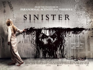
Sinister
This poster has been recognised by alot of the public because of its obscene image, this disturbing picture of the girl spreading blood on the walls signifies that the film will be as gory as the poster. the wall is all crumbled and cracked, htis signifies that the film is grungy as mysterious, quite like the face being shown through the blood on the wall. |
|
|
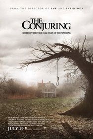
The Conjuring
This poster is simple but also effective, you can see that the effect of the picture shows that is is spooky and mysterious, the house in the background signifies that it is a main part of the film, but the main focus is the noose, as this shows that the film is based around the death of the people in the house. |
|
|
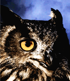
Original Image
|
Final poster
|
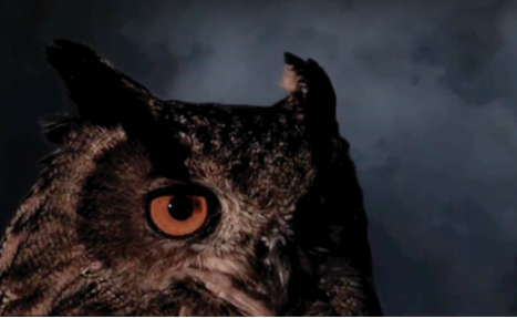
This original photo was taken right at the start of when we first produced out trailer, this is out photo of an owl that we took at the barn owl centre, we placed a green screen behind the bird so we could choose what the back ground is instead of the field that we were in. We took this screen grab as this clearly shows the bird and what the trailer is about, also there was a significant amount of room around the image to add text and titles around it. The image before it was made into the final poster was very dull as far as the colours go, so to make sure that this wasn't the case we spent a whole lesson experimenting with the colours to make them bright and vibrant like they are now.
|
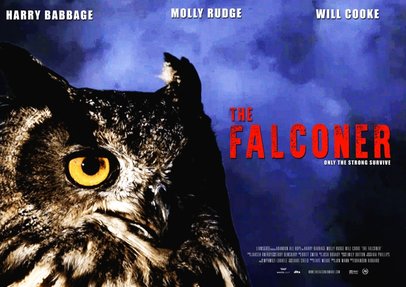
We took the original image and first made it vibrant enough so the bird is the main part of the poster, once we added the mysterious background and enhanced the eyes then we could go on to make the picture a film poster. At the top of the poster we added who is stared in the film as this is what the professional posters do to attract the viewers. The main title "The Falconer" was added in as red as this stands out against the blue background, the blue background also makes the owls eyes pop and makes it look fierce. Like every film poster we added both the distribution and production company at the bottom so people know who it was produced and distributed by.
|
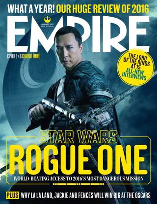
Iconic Magazine
|
Empire is a popular magazine that provides different news stories each week, reviews on recent films and what the upcoming films will be.
In this popular magazine cover they are focusing on the new "Star Wars" film "Rogue One." They have taken a staged scene image that is clearly showing the character and the background that will be scene in the film. They do this through the use of the main character and the death star which is faded into the background; these are important and iconic elements to the film. They have kepta clear colour scheme of yellow and white; the use of yellow is effective because this is the colour of the "Star Wars" logo. Therefore the magazine cover shows a strong representation of the film series. |
Original poster idea (1)
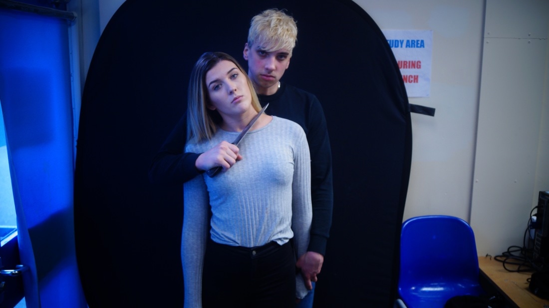
Originally this was going to be our poster picture, this poster shows the killer, victim and the prop, but after shooting more photos we thought that the cast were too exposed and that there needed to be more mystery in the picture, and this is when we decided to use the other final magazine cover.
|
Original Poster idea (2)

This was our final picture that we chose for the magazine, we picked this picture as we thought it didn't say a lot about the film and it was more of a mystery than it being obvious on what the film is about. we kept the hat on to keep him more enclosed and dark, the knife was added into the poster to give it a horror film, poster look. we decided to rest the knife on his chin, this makes the killer look like he is comfortable with his choice of weapon and that he is not scared or curious to use it. as you can see, the killer is dressed in all black, these are the clothes used in the trailer, they are mysterious and dark, this is what we want the killer to come across as.
|
Final Poster
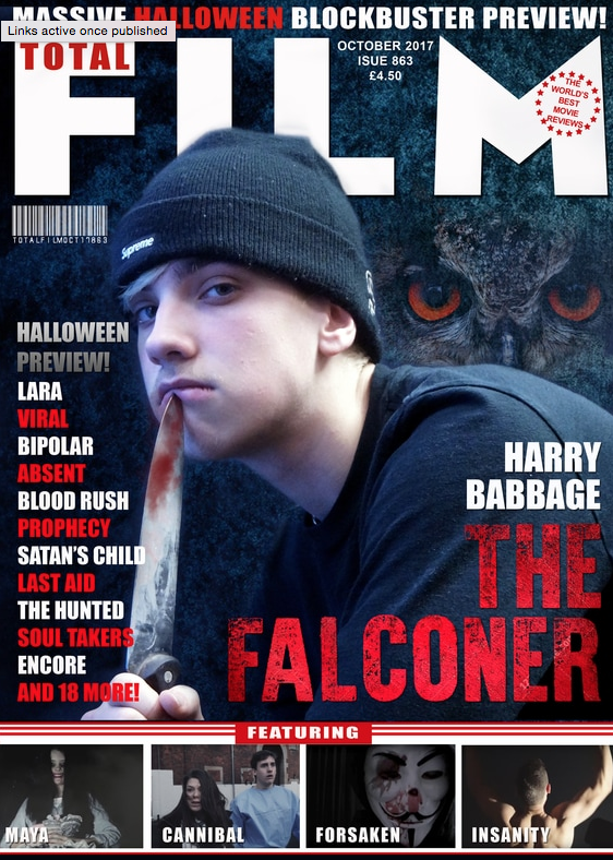
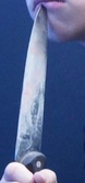
This is the final ,magazine cover with all of the advertisement on it, we added a lot more to he picture than just the killer on the front, this is to give the cover more of an impactful look when the viewers see it. starting with the background added another main part of the film which is the 'owl' by the positioning of the owl over the shoulder shows that the owl is personally linked with the killer, this is exactly how they are in the trailer. Too make the scene more dramatic we photoshopped blood onto the knife, this makes the poster more gory and more relatable to a horror movie, all of the red titles on the poster are horror movie titles, we used red to make the titles pop out like areal professional poster.
|
Conclusion
|
Going though all of the products used throughout the trailer, i can conclude that three items have been consistently been used throughout the trailer. Firstly the "Falconer" font/colour is the same throughout our process, the red signifies death and anger which link i with horror, also it makes the text pop out against the dark background, the withered look on the text shows a grungy and run down look which is normally signified with horror. Secondly one of the main parts in the trailer is the killers weapon, in this case its the knife and we have incorporated it into both the trailer and posters, this gives the viewer an idea if what type of trailer this is. The third and most important part of all of these three iconic images is the "owl" this is the most important as this is what the film is made off, it is the type of thing that will be remembered in the film if not anything else, we incorporated it into the trailer and posters and kept the "falcon" a running theme throughout this project.
Overall with one brand identity or having all of them will increase the popularity of our film and will make it easier for people to link the bird with the trailers and posters . |
|
