In What Way Does Your Media Product Use, Develop Or Challenge Norms And Conventions Of Real Media Products?
Trailer
Using Conventions
The first convention which was used in our trailer was the use of slow dramatic titles. We decided to use this as it is your standard conventional horror setting where you begin the trailer slow and build the pace up as the trailer goes on. This convention is effective as it creates tension which is important to ensure that the audiences attention is captured all of the way through. We used other horror trailers for inspiration for convention ideas.
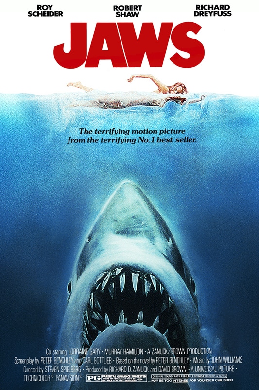
Another convention we decided to include was the use of industrial filters to make the clips darker and more fearful. This is important for creating an effective horror atmosphere within the audience. Some of the shots within our trailer are taken within daylight therefore they have natural lighting but we decided to make them more effective by adding blurred filters and darkened lighting on to the clip. Although we decided not to use any major high key lighting within our trailer as we believed it would create too much of a positive impact on the audience when our target was to make it scary. For this convention, we took ideas from Jaws as it uses a range of different set lightings to portray the mood.
As we wanted to keep the falconer anonymous within our trailer we decided to add more tension into our trailer by adding multiple individuals in the scenes which prevents the audience from knowing who the killer is throughout the trailer. We used completely black clothing for one of our killers and we used up close camera shots to ensure you can't see anyones faces. By keeping the faces disclosed to the audience and using effective angles like when Harry's eyes are rolling back, keeps a fear factor within the audience.
The first convention which was used in our trailer was the use of slow dramatic titles. We decided to use this as it is your standard conventional horror setting where you begin the trailer slow and build the pace up as the trailer goes on. This convention is effective as it creates tension which is important to ensure that the audiences attention is captured all of the way through. We used other horror trailers for inspiration for convention ideas.
Another convention we decided to include was the use of industrial filters to make the clips darker and more fearful. This is important for creating an effective horror atmosphere within the audience. Some of the shots within our trailer are taken within daylight therefore they have natural lighting but we decided to make them more effective by adding blurred filters and darkened lighting on to the clip. Although we decided not to use any major high key lighting within our trailer as we believed it would create too much of a positive impact on the audience when our target was to make it scary. For this convention, we took ideas from Jaws as it uses a range of different set lightings to portray the mood.
As we wanted to keep the falconer anonymous within our trailer we decided to add more tension into our trailer by adding multiple individuals in the scenes which prevents the audience from knowing who the killer is throughout the trailer. We used completely black clothing for one of our killers and we used up close camera shots to ensure you can't see anyones faces. By keeping the faces disclosed to the audience and using effective angles like when Harry's eyes are rolling back, keeps a fear factor within the audience.
Developing Conventions
We decided that a linear sequence would not be suitable for our trailer. This is due to our planned storyline which fitted a non-linear sequence far better due to there being a range of shots which wouldn't fit in with a linear timeline. For this idea we took inspiration from...
We also decided we to include an uncommon horror aspect by using birds of prey within our trailer. We wanted to tie this in with a mentally unstable falconer who has spent his entire life around birds of prey with a power to visualise through the eyes of birds. We took inspiration for this idea from..
We decided by choosing an uncommon storyline that we would obtain more views.
Challenging Conventions
Our group decided to use multiple victims within our trailer as we wanted it to focus more on the aspect of death within individuals and the build up to their deaths. By doing this instead of focusing on one individual allows the potential for the trailer to be turned into a film. We used each character within the trailer equally yet we managed to emphasise the insanity of the falconer. Tudor's theory on using a main female protagonist was an option for us but we decided that by using more than one victim would create a better atmosphere for our target audience. We decided to use to run our trailer along the lines of Wheeler Winston Dixon's theory on 'sites of activity' where you are able to understand the theme of the trailer but you never create a connection with any of the characters, yet you still see their deaths. We took our inspiration for the use of multiple victims from the film 'The Gallows' and 'Severance'.
We decided not to show the killers identity within our trailer as it is unique to not see the killer within trailers due to there not being many examples in your conventional horror. As we started off originally with the falconer being the only killer we decided to stick with that idea yet we would disguise him throughout the trailer. We decided to keep the Falconer as the only killer as it makes the danger seem a lot more threatening to our protagonists. We decided to use the ring leader theory where the killer is wearing a hoodie.We took inspiration from 'Eden Lake' for this idea because we felt multiple killers enhanced the mystery of the slasher genre.
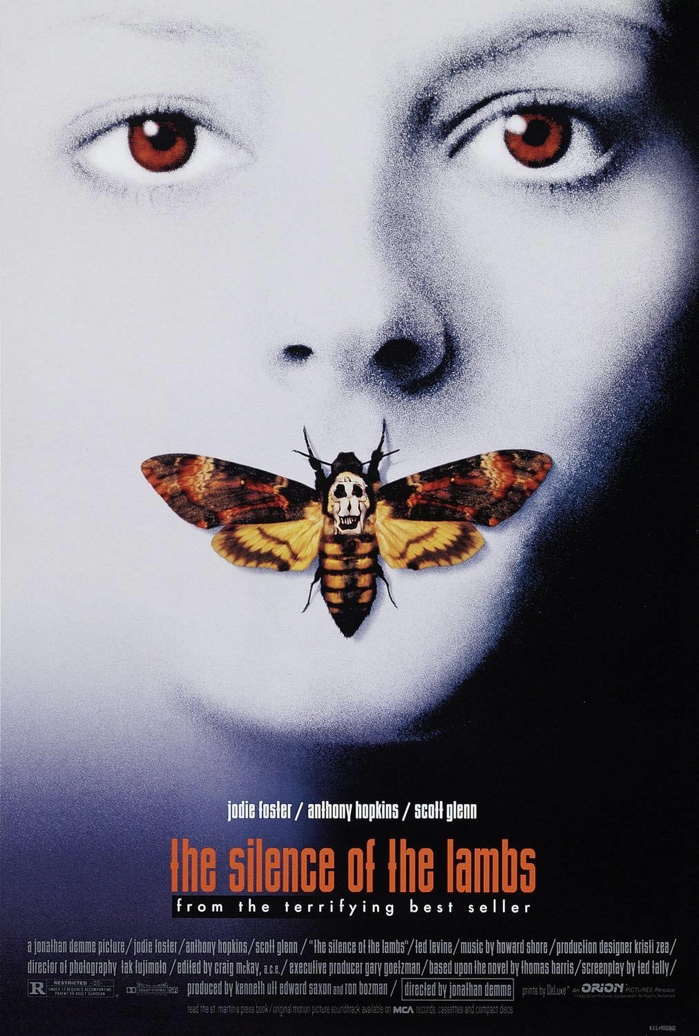
We decided to have birds of prey as the 'stalkers' within our movie trailer. This challenges the convention of a male being the only killer within a horror. We wanted to have an idea that was unique and that would grab peoples attention. Although we didn't want to completely remove the horrific feel from the trailer which would only involve the male antagonist, so we decided to take inspiration from the films 'Jaws' and 'Silence of the lambs' as these movies don't involve male killers either.
An important decision we had to make was keeping the dialogue for the trailer to a minimal because we believe that the shots of the trailer actually are effective enough to allow the audience to understand the storyline. However by having dialogue it makes the trailer more effective due to the narration being in a terrifying voice.
We decided that a linear sequence would not be suitable for our trailer. This is due to our planned storyline which fitted a non-linear sequence far better due to there being a range of shots which wouldn't fit in with a linear timeline. For this idea we took inspiration from...
We also decided we to include an uncommon horror aspect by using birds of prey within our trailer. We wanted to tie this in with a mentally unstable falconer who has spent his entire life around birds of prey with a power to visualise through the eyes of birds. We took inspiration for this idea from..
We decided by choosing an uncommon storyline that we would obtain more views.
Challenging Conventions
Our group decided to use multiple victims within our trailer as we wanted it to focus more on the aspect of death within individuals and the build up to their deaths. By doing this instead of focusing on one individual allows the potential for the trailer to be turned into a film. We used each character within the trailer equally yet we managed to emphasise the insanity of the falconer. Tudor's theory on using a main female protagonist was an option for us but we decided that by using more than one victim would create a better atmosphere for our target audience. We decided to use to run our trailer along the lines of Wheeler Winston Dixon's theory on 'sites of activity' where you are able to understand the theme of the trailer but you never create a connection with any of the characters, yet you still see their deaths. We took our inspiration for the use of multiple victims from the film 'The Gallows' and 'Severance'.
We decided not to show the killers identity within our trailer as it is unique to not see the killer within trailers due to there not being many examples in your conventional horror. As we started off originally with the falconer being the only killer we decided to stick with that idea yet we would disguise him throughout the trailer. We decided to keep the Falconer as the only killer as it makes the danger seem a lot more threatening to our protagonists. We decided to use the ring leader theory where the killer is wearing a hoodie.We took inspiration from 'Eden Lake' for this idea because we felt multiple killers enhanced the mystery of the slasher genre.
We decided to have birds of prey as the 'stalkers' within our movie trailer. This challenges the convention of a male being the only killer within a horror. We wanted to have an idea that was unique and that would grab peoples attention. Although we didn't want to completely remove the horrific feel from the trailer which would only involve the male antagonist, so we decided to take inspiration from the films 'Jaws' and 'Silence of the lambs' as these movies don't involve male killers either.
An important decision we had to make was keeping the dialogue for the trailer to a minimal because we believe that the shots of the trailer actually are effective enough to allow the audience to understand the storyline. However by having dialogue it makes the trailer more effective due to the narration being in a terrifying voice.
Movie Poster
When we were creating our poster, we decided to use a dark colour scheme in order to make our poster seem more sinister to our audience. This seemed the better option in comparison to using a lighter colour option which wouldn't have given us the mysterious effect which we have achieved. We have taken inspiration from the movie posters for the films 'Mirrors' and 'Scream' as they both have very dark posters which represent a sinister feel towards the audience.
This would mean that we developed this convention as colour schemes on horror movie posters have generally been fifty-fifty in the last decade. For example, 'Mirrors' and 'Scream 4' have very dark posters to represent them however 'The Forest' and 'Sinister' have much lighter colour schemes within their posters, we definitely took more inspiration from the darker colour schemes when it came to creating our own poster. Overall, I think that using the darker colours for our poster links well with our storyline and represents our trailer appropriately. We decided to add in some hints of red within the text, and this would follow convention as most movie posters involve the colour red to represent the blood and gore within the movie.
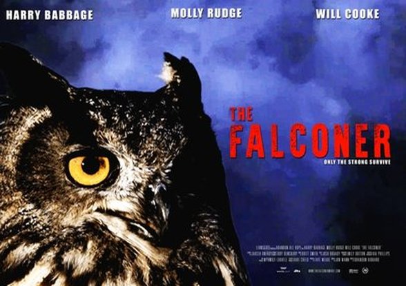
For the image on our poster, as our storyline involved birds of prey, we thought that it would be effective to use an owl for our poster to obviously state what our trailer will be about. We decided to use the bird opposed to using the killer as we didn't want to focus on the murderer as the bird is a unique way of representing our story. This would be a developing convention as many horror trailers tend to use their killer as the main feature for their film poster, however it is also common to use the victim as the focal point. The films 'A Nightmare on Elm Street' and 'Saw 2' both use their killers to create a taunting image for their posters however, 'The Gallows' (our swede trailer) has used their victim to create a poster that shows the vulnerability of the character which then foreshadows the events in the trailer. Some posters may have both victim and killer on the poster, such as 'The Reaping' which shows both the creepiness of the possessed and the unknowingness of the other leading character.
We decided to have our poster in the landscape position as we wanted to emphasise the detail of the bird as it is the main image. This challenges convention as famous movie posters are almost always portrait as this makes it easier to display when advertising the movie. By having the desired image for our poster in mind we were able to develop it to be both aesthetically pleasing and informative to our audience. This is because we wanted it to be as effective as possible when advertising to attract our target audience. When writing the text onto the poster we decided to keep it traditional by keeping the text names at the top of the poster. This allows people to clearly see you is in the movie and whether the target audience will want to watch it. Credits are kept at the bottom of the poster in small print and the title to the right of the image due to the way the image is placed.
The font we chose for our movie poster was 'War is over' which is a basic yet bold and clear font. We didn't want to use a font which was too 'fancy' as they can sometimes be hard to read and can ruin the horror aspect of our poster. We wanted our poster to represent our trailer in all aspects so we didn't complicate it. We took inspiration from the trailers below. This may be a developing convention as many horror movie posters have clear fonts, whereas others may rely on their font choice to represent their movies, such as 'The Ring' and 'Poltergeist.'
This would mean that we developed this convention as colour schemes on horror movie posters have generally been fifty-fifty in the last decade. For example, 'Mirrors' and 'Scream 4' have very dark posters to represent them however 'The Forest' and 'Sinister' have much lighter colour schemes within their posters, we definitely took more inspiration from the darker colour schemes when it came to creating our own poster. Overall, I think that using the darker colours for our poster links well with our storyline and represents our trailer appropriately. We decided to add in some hints of red within the text, and this would follow convention as most movie posters involve the colour red to represent the blood and gore within the movie.
For the image on our poster, as our storyline involved birds of prey, we thought that it would be effective to use an owl for our poster to obviously state what our trailer will be about. We decided to use the bird opposed to using the killer as we didn't want to focus on the murderer as the bird is a unique way of representing our story. This would be a developing convention as many horror trailers tend to use their killer as the main feature for their film poster, however it is also common to use the victim as the focal point. The films 'A Nightmare on Elm Street' and 'Saw 2' both use their killers to create a taunting image for their posters however, 'The Gallows' (our swede trailer) has used their victim to create a poster that shows the vulnerability of the character which then foreshadows the events in the trailer. Some posters may have both victim and killer on the poster, such as 'The Reaping' which shows both the creepiness of the possessed and the unknowingness of the other leading character.
We decided to have our poster in the landscape position as we wanted to emphasise the detail of the bird as it is the main image. This challenges convention as famous movie posters are almost always portrait as this makes it easier to display when advertising the movie. By having the desired image for our poster in mind we were able to develop it to be both aesthetically pleasing and informative to our audience. This is because we wanted it to be as effective as possible when advertising to attract our target audience. When writing the text onto the poster we decided to keep it traditional by keeping the text names at the top of the poster. This allows people to clearly see you is in the movie and whether the target audience will want to watch it. Credits are kept at the bottom of the poster in small print and the title to the right of the image due to the way the image is placed.
The font we chose for our movie poster was 'War is over' which is a basic yet bold and clear font. We didn't want to use a font which was too 'fancy' as they can sometimes be hard to read and can ruin the horror aspect of our poster. We wanted our poster to represent our trailer in all aspects so we didn't complicate it. We took inspiration from the trailers below. This may be a developing convention as many horror movie posters have clear fonts, whereas others may rely on their font choice to represent their movies, such as 'The Ring' and 'Poltergeist.'
|
|
|
|
Magazine Cover
|
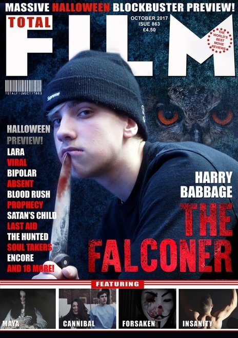
We went with red as the accent colour throughout the magazine cover and for the main title as we wanted to link it with the accents we have used within the film trailer. This follows your conventional horror magazine cover as red is a symbolic colour for horror. By using the colour red it represents blood and this is what creates a sense of fear amongst the audience. We used white as it stands out in front of the dark background and it represents purity. The image of Harry we decided to use has a dark colour tone to it which represents death. However, we have challenged convention as most horror magazine covers use black to undertone their image.
This makes our magazine cover different from your conventional horror magazine cover. |
|
We decided to take an additional picture of Harry to use for our magazine cover as we wanted to challenge the convention of seeing the killer in all black as the front cover which is what we had recorded within the trailer. We also included an image of an owl which we took ourselves at the owl sanctuary in Gloucester. We wanted to include the owl within the cover as they are a main context within our trailer. We wanted to take a more aesthetic approach towards the creation of our magazine cover which is why we didn't use any images from our actual trailer. By using Harry it is attracting our target audience and the higher quality image helps us to do this.
Magazine covers rarely actually use a feature shot from the movie trailer itself as without the rest of the images there is no context to it. We decided to only use one character on the cover opposed to two as it allows the audience to focus on only one character and it shows that the film is about only one killer. When positioning Harry and the Owl we decided to place the Owl looking over Harry's shoulder as the trailer involves Harry looking through the eyes of the Owl. Therefore by having the Owl present in the background shows its relevance to the trailer and to Harry.
Magazine covers rarely actually use a feature shot from the movie trailer itself as without the rest of the images there is no context to it. We decided to only use one character on the cover opposed to two as it allows the audience to focus on only one character and it shows that the film is about only one killer. When positioning Harry and the Owl we decided to place the Owl looking over Harry's shoulder as the trailer involves Harry looking through the eyes of the Owl. Therefore by having the Owl present in the background shows its relevance to the trailer and to Harry.
We positioned the main title of the magazine in the bottom right of the cover so that it allows the majority of the audience's focus to be on the actual page and image. This follows your standard conventional magazine cover style as titles are either placed at the top or the bottom of the magazine cover. This is so that customers can clearly see what they are purchasing. We placed the title at the bottom right overlapping Harry's arm but leaving the rest of the image untouched. We did not want to obstruct the image of Harry as this is a conventional measure which other magazine cover companies use. We included some additional extras to our magazine cover such as a barcode and a rating mark from 'the world's best movie reviews'. These were essentially our finishing touches to the cover which gives it a more professional look. At the bottom of the magazine I have added some thumbnails of other movies as advertisement. This is what follows the standard conventional style as they all feature advertising for movies that are not featured on the cover.
We decided to use the fonts featured on a conventional magazine cover. We didn't want to stray too far from convention because that would have made the cover look unprofessional and wouldn't go with the horror genre. We used a template for the title as to make it seem like it was made by the company 'Total Film' and we recoloured it so that it would go with our colour scheme. The title of the magazine is larger than the rest of the text, with our movie title being only a fraction smaller and the rest of the text ranges from around size 26-40 (with the whole cover being A3 sized). We decided to follow convention with the size of the text because straying too far from that would have created an unbalanced cover and given it an unprofessional feel. We developed this convention by positioning the text a little bit differently from a conventional horror movie cover.
We decided to use the fonts featured on a conventional magazine cover. We didn't want to stray too far from convention because that would have made the cover look unprofessional and wouldn't go with the horror genre. We used a template for the title as to make it seem like it was made by the company 'Total Film' and we recoloured it so that it would go with our colour scheme. The title of the magazine is larger than the rest of the text, with our movie title being only a fraction smaller and the rest of the text ranges from around size 26-40 (with the whole cover being A3 sized). We decided to follow convention with the size of the text because straying too far from that would have created an unbalanced cover and given it an unprofessional feel. We developed this convention by positioning the text a little bit differently from a conventional horror movie cover.
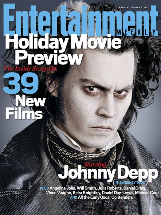
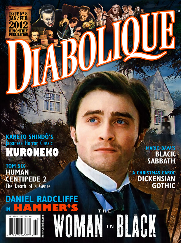
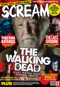
Beneath are a few of the magazine covers that we took inspiration from in order to create and develop our magazine cover to as effective as possible. The aim was to make our magazine poster dark and mysterious and to be the best horror magazine cover around. We decided to use Harry to pull a lifeless facial expression to ensure that a lifeless vibe is given off to the audience when they see the cover. We wanted our magazine cover to look the the Scream magazine shown below about the walking dead series. It shows cast members on it which we decided was effective as it makes the cover more appealing if there are more individuals on it. We also decided to use an owl faded into the background over Harry's shoulder as it creates a scarier impact to the cover. Our layout was to have one main image (Harry) and then smaller images as this tends to be the standard design regime used for magazine covers.
Having more than one person may challenge convention as magazine covers (especially horror) normally only have one person or feature from the movie it is representing, however when looking for inspiration with more than one person we found that it seemed to be fairly common.
Having more than one person may challenge convention as magazine covers (especially horror) normally only have one person or feature from the movie it is representing, however when looking for inspiration with more than one person we found that it seemed to be fairly common.
|
|
|
|
